names(clutch)<-tolower(names(clutch))4 Non-linear regression
Exercise 1
The data for this exercise are contained in the Data4Ecologists package and can be accessed by loading the packaging and then typing data(clutch).
Read in the data set and look at the first 6 records using the
headfunction.Note that clutch size is contained in a variable named
CLUTCH. You can access the variable names with thenamesfunction. Change the variable names so that they are all lower case using:
- Create a scatterplot to explore how clutch size (
clutch) varies byyearand nest initiation date (date). Note:dateis measured as the number of days since Jan 1, so it really reflects Julian day.
It will help to first tell R that year should be treated as a categorical variable. To do this, use:
clutch$year<-as.factor(clutch$year)One option for creating the plot is to use ggplot in the ggplot2 library:
ggplot(clutch, aes(x = date, y = clutch, color = year)) + geom_point()or
ggplot(clutch, aes(x = date, y = clutch)) + geom_point()+facet_wrap(~ year)There are several large outliers representing nests that were parasitized. Lets drop all observations with clutch sizes > 15 (e.g., using the
subsetfunction ordplyr::filterfunction [indplyrpackage]). If you are unfamiliar with these functions, explore their help pages by typing?subsetor?filterinto the R console.Ignore the fact that most of the nest structures were observed for multiple years (i.e., the observations are not necessarily independent). Fit a linear model relating
clutchtoyearanddate. Evaluate whether the assumptions of linear regression are reasonably met.Fit a model using
lm, allowing for a quadratic relationship betweendateandclutch. Evaluate whether the assumptions of linear regression are reasonably met. Note: theresid_panelfunction does not seem to work with models that include terms created usingpolyorns. You can use the defaultplotfunction or theplot_modelfunction in thesjPlotpackage withtype = "diag". Or, try thecheck_modelfunction in theperformancepackage. Comment on whether you think the assumptions of linear regression are reasonably met.Now, fit a linear spline model, with a single knot at
date= 150. You will need to create a new predictor that is 0 ifdate\(<=150\) and =date- 150 otherwise. Again, evaluate whether the assumptions of linear regression are reasonably met.Create a plot showing the fit of the model, overlaid on the original data. You can get fitted values from the model for a reasonable range of predictor values using:
newdat<-data.frame(expand.grid(date=seq(90, 180, by = 1), year=c("1997", "1998", "1999")))
newdat$fitted<-predict(modelname, newdata = newdat)
One option for creating the plot is to use the plot function. Then, add the fitted lines using the lines function (once call to lines for each year).
Alternatively, you can use ggplot:
ggplot(newdat, aes(date, fitted, color = year)) + geom_line() +
    geom_point(data = clutch, aes(date, clutch)) + xlab("Nest Initiation date") +
ylab("Fitted values")- Fit a model with natural cubic regression splines and 3 degrees of freedom allocated to date. You will need to load the
splineslibrary and then usens(date,3)as a predictor. Look at a residuals versus fitted values plot for these data. Create a plot showing the fit of the model, overlaid on the original data.
Exercise 2
Consider the ElephantsMF data set in the Stat2Data library (Cannon et al. 2019), which contains data collected by Lee et al. (2013). The data set has 3 variables collected from 288 African elephants that lived through droughts in the first two years of their life.:
- Age (in years)
- Height (shoulder height in cm)
- Sex F = female, M = Male
Plot the data, showing the relationship between
HeightandAgefor each sex.Fit a linear model to data:
lm(Height ~ Age*Sex, data = ElephantsMF). Evaluate the assumptions of the model graphically. Be sure to comment on what you are looking for in each plot (e.g., the assumption you are looking to evaluate and what would constitute an assumption violation).Fit a model that allows the relationship between Height and Age to be non-linear and to also differ for males and females. Again, evaluate the assumptions of the model graphically.
Plot the fit of your model from step 3 with the data overlaid.
Exercise 3
This exercise will explore how polynomials, simple linear splines, and restricted cubic regression splines can be used to model non-linear relationships between a predictor, \(X\), and the mean response at a given value of \(X\), \(E[Y|X]\).
This exercise is largely constructed from a tutorial written by Patrick Heagerty, a professor in the Biostatistics Department at University of Washington.
Linear model: We will purposely simulate data where a linear model will not be appropriate.
- Simulate a predictor variable that takes on values 1:24
x <- c(1:24)- Simulate a response variable that is predicted by the variable, \(X\), but in a highly non-linear way:
mu <- 10 + 5 * sin( x * pi / 24 )  - 2 * cos( (x-6)*4/24 )
set.seed(2010)
eps <- rnorm( length(mu) )
y <- mu + eps- Plot the data showing the relationship between \(X\) and \(Y\) along with the least-squares regression line.
Linear Spline model: We can fit a model where the slope of the line relating \(Y\) to \(X\) changes at different locations, called knots.
- Create a set of basis vectors to allow fitting a linear spline model with changes in the slope at \(X = 6, 12,\) and \(18\). The first basis vector, \((X-6)_+\) can be created using:
x6 <-ifelse(x <6, 0, x-6)This creates a predictor that can be included as a column in the design matrix. This predictor will be 0 when \(X \le 6\) and \(X-6\) when \(X > 6\). Create similar predictors to capture changes in slope for \(X > 12\) and \(X > 18\).
- Fit a model that includes these the 3 basis functions: \(Y = \beta_0 + \beta_1X_i + \beta_2(X_i-6)_+ + \beta_3(X_i-12)_+ + \beta_4(X_i-18)_+ + \epsilon_i\). Overlay the fitted mean on a scatterplot of the data. You can use the
predictfunction with your fitted model object to calculate the fitted mean:
\(\hat{Y}_i = \hat{E}[Y_i|X_i] = \hat{\beta}_0 + \hat{\beta}_1X_i + \hat{\beta}_2(X_i-6)_+ + \hat{\beta}_3(X_i-12)_+ + \hat{\beta}_4(X_i-18)_+\)
- Plot the columns of the design matrix from the linear spline model versus \(X\), i.e., plot:
- \(1\) versus \(X\)
- \(X\) versus \(X\)
- \((X-6)_+\) versus \(X\)
- \((X-12)_+\) versus \(X\)
- \((X-18)_+\) versus \(X\)
- Plot the weighted columns of the design matrix from the linear spline model versus \(X\), i.e., plot:
- \(\hat{\beta}_01\) versus \(X\)
- \(\hat{\beta}_1X\) versus \(X\)
- \(\hat{\beta}_2(X-6)_+\) versus \(X\)
- \(\hat{\beta}_3(X-12)_+\) versus \(X\)
- \(\hat{\beta}_4(X-18)_+\) versus \(X\)
Note, if we add these contributions (i.e., from a-e) for any given value of \(X\), we get \(\hat{Y}_i = \hat{E}[Y_i|X_i] = \hat{\beta}_0 + \hat{\beta}_1X_i + \hat{\beta}_2(X_i-6)_+ + \hat{\beta}_3(X_i-12)_+ + \hat{\beta}_4(X_i-18)_+\).
- What is the slope of the fitted curve when \(X = 3\)? How about when \(X = 9, 14,\) and \(19\)?
Polynomial model: One disadvantage of the linear spline model is that it is not as “smooth” as we might desire (e.g., it is not continuous at the knot locations, \(X = 6, 12, 18\)). One way to create a model that is “smooth” is to use polynomial terms. This will result in a model that is continuous and its first derivative will also be continuous (so, there will be no quick changes in the direction of \(E[Y|X]\) as we increase or decrease \(X\)).
Create a set of basis vectors, \(X\), \(X^2\), and \(X^3\), to fit a cubic polynomial model: \(Y = \beta_0 + \beta_1X_i + \beta_2X_i^2 + \beta_3X_i^3 + \epsilon_i\). Fit this model and overlay the fitted mean on a scatterplot of the data. You can get the values of the fitted mean using the
predictfunction along with your fitted model object.Plot the columns of the design matrix versus \(X\), i.e., plot:
- \(1\) versus \(X\)
- \(X_i\) versus \(X\)
- \(X_i^2\) versus \(X\)
- \(X_i^3\) versus \(X\)
- Plot the weighted columns of the design matrix versus \(X\), i.e., plot:
- \(\hat{\beta}_01\) versus \(X\)
- \(\hat{\beta}_1X_i\) versus \(X\)
- \(\hat{\beta}_2X_i^2\) versus \(X\)
- \(\hat{\beta}_3X_i^4\) versus \(X\)
Again, if we add these 4 contributions up for any given value of \(X\), we get \(\hat{Y}_i = \hat{E}[Y_i|X_i] = \hat{\beta}_0 + \hat{\beta}_1X_i + \hat{\beta}_2X_i^2+ \hat{\beta}_3X_i^3\).
Cubic regression splines with truncated basis functions: Next, we will consider a model with a set of cubic sline basis functions that we create ourselves.
- Create a set of cubic regression spline basis vectors, \((X-6)^3_+\), \((X-12)^3_+\), and \((X-18)^3_+\) to go with the polynomial basis vectors from steps 9-11 (these can be formed by simply raising the basis vectors from step 4 to the third power). For example, we can create \((X-6)^3_+\) using:
x6 <-ifelse(x <6, 0, x-6)
x6cubed <- x6^3
These additional basis vectors will allow our fitted cubic function to change after each knot location. In essence, we will end up with a different cubic fit within each segment: \(X < 6, 6 \le X < 12, 12 \le X <18, X \ge 18\).
Fit the model with these additional terms:
\(Y = \beta_0 + \beta_1X_i + \beta_2X_i^2 + \beta_3X_i^3 + \beta_4(X-6)^3_+ + \beta_5(X-12)^3_+ + \beta_6(X-18)^3_+ +\epsilon_i\).
Overlay the fitted mean on a scatterplot of the data.
Natural cubic regression splines: Next, we fit a model with natural cubic regression spline basis functions. This will allow again for a piecewise cubic model within each segment formed by our interior knots but linear fits outside of the boundary knots. We can use the splines package to form our basis vectors. We will use the same set of interior knots (6, 12, 18) and set the boundary knots to the minimum and maximum values in the data set (\(X = 1\) and \(X=24\), respectively).
Load the
splinespackage and fit the cubic regression spline model using:fit <- lm( y ~ ns(x, knots=c(6, 12, 18))).Use the predict function to overlay the fitted model on the data.
Plot the basis vectors versus \(X\) or the weighted basis vectors versus \(X\). You can access the basis vectors directly by using the
model.matrixfunction to pull off the different columns of the design matrix.Comment on the relative strengths and weaknesses of the different approaches considered (i.e., linear models, linear splines, polynomials, cubic regression splines).
Exercise 4
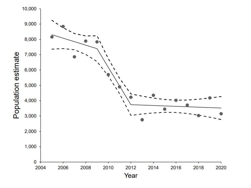
The code, below, reads in data containing estimates of the number of Moose in Minnesota between 2005 and 2020:
nmoose<-data.frame(year=2005:2020,
                   estimate = c(8160, 8840, 6860, 7890, 7840, 5700, 4900, 4230, 2760, 4350, 3450, 4020, 3710, 3030, 4180, 3150))
Fit a linear regression model to the data and evaluate whether the assumptions are reasonable. Make sure to comment on what you would expect to see in each plot if the assumptions of linear regression were met.
Fit a model that allows for a non-linear trend in moose numbers over time, using linear or cubic regression splines. Plot the data with the fitted curve, similar to the picture below from the MN DNR report in which they analyze the trend in moose numbers over time.
Exercise 5
This exercise largely comes from Catherine Polik who took FW8051 in the Spring of 2023, and will use data from one of her published papers (Polik, Elling, and Pearson 2018). I am going to do my best to set the stage, but I would encourage you to read her paper to learn more!
For this exercise, we are going to model the relationship between sea-surface temperature (SST) anomalies and a nitrogen isotropic signature (\(\delta^{15}N\)) measured in two different types of sediment:
- Sapropels, which are dark-colored sediments, rich in organic matter.
- Marl sediment, which is carbon-poor and next to the Sapropels.
The temperature anomalies (our response variable) represent discrepancies between two different methods for reconstructing sea-surface temperature from molecular signatures in marine sediment cores (\(TEX_{86}\) and \(U^{K'}_{37}\)). The \(\delta^{15}N\) measurements are lower in Sapropel sediments and likely capture N-cycling dynamics during periods of high productivity. The accelerated growth of ammonia-oxidizing organisms (in the Archaea domain) is thought to impact SST measurements reconstructed using the \(TEX_{86}\) method, and thus, likely impact the temperature anomalies.
The data set can be accessed from the Data4Ecologists package as follows:
library(Data4Ecologists)
library(ggplot2)
Warning: package 'ggplot2' was built under R version 4.5.2data(PolikSST)The data set contains the following variables:
Site= Location where the core was taken during Leg 160 of the Ocean Drilling ProgramSapropel= Three sapropels sampled: S3 (81 ka), S5 (124 ka), and i-282 (2.943 Ma)mbsf= Meters below seafloor, i.e. the depth of the sampled15N.TN= The nitrogen isotopic value of the bulk sediment, in permilTEX86.SST= SST reconsctructed using the TEX86 method, in \(^{\circ}\)CUk37.SST= SST reconsctructed using the Uk37 method, in \(^{\circ}\)CTemp.AnomalyThe difference between TEX86 and Uk37 SST reconstructionsSediment= Whether the sample comes from inside the sapropel or from the surrounding, carbon-poor marl sediment
Before starting the exercise, filter out any observations that are missing values for either Temp.Anomaly or d15N.TN using the following code:
library(dplyr)
PolikSST <- PolikSST %>%
  filter(!is.na(Temp.Anomaly)) %>%
  filter(!is.na(d15N.TN))
Use ggplot to create a scatterplot of
Temp.Anomaly(y-axis) versusd15N.TN(x-axis), mappingSedimentto different colors.Fit an appropriate linear model allowing the relationship between
d15N.TNandTemp.Anomalyto depend on theSedimenttype.If we were to look at residual plots or consider the independence assumption, we might be reluctant to use this model. For now, however, we will proceed as though the assumptions are reasonably met. Use the fitted model to answer the following questions:
- By how much do we expect
Temp.Anomalyto increase, on average, for every 1 unit increase ind15N.TNwhenSediment=Sapropel?
- By how much do we expect
Temp.Anomalyto increase, on average, for every 1 unit increase ind15N.TNwhenSediment=Marl?
- By how much do we expect
Instead of fitting models with separate slopes for the two sediment types, fit a model where
Temp.Anomalydepends only ond15N.TN, but use a quadratic polynomial to model this relationship. Make sure to use raw polynomials (poly(x, 2, raw = TRUE)) (this will be important for part 5 of the problem). Plot the fitted model on top of a scatterplot of the data.We can use derivatives and calculus to estimate the value of
d15N.TNassociated with the maximum temperature anomaly. Our fitted model implies:
\(E[Y|X] = \beta_0 + \beta_1X + \beta_2X^2\)
Let’s take a derivative of this experession with respect to \(X\), set it equal to 0, and solve for \(X\):
\(\frac{dE[Y|X]}{dX} = \beta_1 + 2\beta_2X = 0\).
This implies that the maximum occurs at \(X = \frac{-\beta_1}{2\beta_2}\).
Plug in the estimated coefficients to estimate the value of d15N.TN associated with the maximum expected temperature anomaly.
- Instead of a quadratic model, fit a linear spline model with a single knot located at the value of \(X\) given in your answer to part 5. Plot the fitted model over a scatterplot of the data.
Exercise 6
The metabolic rate (measured here as Oxygen Consumption) of ectotherms typically increases with temperature, but this relationship is rarely linear. At very high temperatures, metabolic efficiency may drop, or the rate of increase may shift. The copepod dataset in the Data4Ecologists package contains measurements of oxygen consumption at different ambient temperatures from 120 individual marine copepods.1
Variables:
Temp: Ambient water temperature (C), ranging from 5C to 30C.Oxygen: Mass-specific oxygen consumption rate (\(\mu g\) \(O_2\) / mg / hour).
We can load the data using:
library(Data4Ecologists)
data(copepod)
We will also load the splines, ggplot2, dplyr, and performance packages for this exercise.
library(splines) # for non-linear fits
library(ggplot2) # for plots
library(performance)  # for residual checks
library(dplyr) # for data wrangling
Initial Visualization: Load the data and create a scatterplot of Oxygen (y-axis) vs. Temp (x-axis). Fit a linear model and inspect the residuals using the
check_modelfunction in theperformancepackage. Is a simple linear regression model appropriate for this dataset? Use the visualizations to support your answer.Fit the following models using the
lmfunction:
- a model with a linear spline and a single knot that you choose based on the scatterplot. Although there are R packages (e.g.,
lspline) that could be used to fit the model, I would like you to create the design matrix and fit the model using thelmfunction. - a model with linear and quadratic terms, using
lm+ thepolyfunction. - a cubic spline model (you choose the degrees of freedom) fit using
lm+ thensfunction
Which model do you prefer and why? Things you could consider include: AIC, residual plots, an effect plot showing the fit of the model on top of the data.
Are there any downsides to using the scatterplot to choose the knot location for the linear spline or to determine the number of knots/degrees of freedom for the cubic regression spline after viewing the data?
To help explore this question, note that these data were simulated using the following code:
# Set up
set.seed(123)
n <- 120
temp <- seq(5, 30, length.out = n)

# Create a non-linear response: slow increase then steeper, then plateau
oxygen<- 0.5 + 0.02 * temp + 0.005 * (temp-10)^2 - 0.0003 * (temp-10)^3 + rnorm(n, sd = 0.2)
copepod <- data.frame(Temp = temp, Oxygen = oxygen)
What if we simulated a new (“test” or “evaluation”) data set and used it to calculate an “out-of-sample” \(R^2\) that measures the percent of variation explained by the model when applied to a NEW data set? This could be done as follows:
- Generate a new data set using the exact same data generating model (we will keep the temperatures fixed, assuming that these are under the control of the experimenter). HINT: for the linear spline model, you will have to make sure
copepod.newincludes the linear spline basis vector you created to fit the model. Assuming, say, you named this new column of our datasetTemp.basis, then the following should work:
oxygen.new<- 0.5 + 0.02 * temp + 0.005 * (temp-10)^2 - 0.0003 * (temp-10)^3 +rnorm(n, sd = 0.2)
copepod.new <- data.frame(Temp = temp, Oxygen = oxygen.new, Temp.basis = copepod$Temp.basis)- For each of the 4 models, generate predictions for the new data using the
predictfunction. For exa,ple, if the linear model is saved asm1, we would use:
preds <- predict(m1, newdata = copepod.new)- Next, we calculate the Residual Sum of Squares (RSS) and Total Sum of Squares (TSS) using the new data’s response values.
rss <- sum((copepod.new$Oxygen - preds)^2)
tss <- sum((copepod.new$Oxygen - mean(copepod.new$Oxygen))^2)- Lastly, we calculate the out-of-sample \(R^2\):
(r2_oos <- 1 - (rss / tss))Alternatively, we could use the yardstick package to get out-of-sample \(R^2\)’s for all 4 models (assuming we saved them as m1, m2, m3 and m4) as follows:
library(yardstick)
results <- data.frame(truth = copepod.new$Oxygen,
     estimate.lm = predict(m1, newdata = copepod.new),
     estimate.lsp = predict(m2, newdata = copepod.new),
     estimate.poly = predict(m3, newdata = copepod.new),
     estimate.cubic = predict(m4, newdata = copepod.new)
 )

# Calculate R-squared
rsq(results, truth = truth, estimate = estimate.lm)$.estimate
rsq(results, truth = truth, estimate = estimate.lsp )$.estimate
rsq(results, truth = truth, estimate = estimate.poly)$.estimate
rsq(results, truth = truth, estimate = estimate.cubic)$.estimate
Use a for loop to simulate 100 new data sets using the exact same data-generating model (as above) and then calculate out-of-sample \(R^2\) values (by adapting the code above). Then compare the distribution of the out-of-sample \(R^2\) values for these 100 fitted models to the original in-sample \(R^2\) provided by the summary or using the code, below:
r.orig <- data.frame(r2 = c(summary(m1)$r.squared, summary(m2)$r.squared,
                           summary(m3)$r.squared, summary(m4)$r.squared),
                    model = c("linear", "linear spline",
                                  "polynomial", "cubic spline"))
r.orig- After inspecting the results, comment on what you may have learned from the simulation part of this exercise. If you were unsuccessful in completing it, comment on what you might expect to see if you had been successful.
References
Cannon, Ann, George Cobb, Bradley Hartlaub, Julie Legler, Robin Lock, Thomas Moore, Allan Rossman, and Jeffrey Witmer. 2019. Stat2Data: Datasets for Stat2. https://CRAN.R-project.org/package=Stat2Data.
Lee, Phyllis C, Luc F Bussière, C Elizabeth Webber, Joyce H Poole, and Cynthia J Moss. 2013. “Enduring Consequences of Early Experiences: 40 Year Effects on Survival and Success Among African Elephants (Loxodonta Africana).” Biology Letters 9 (2): 20130011.
Polik, Catherine A, Felix J Elling, and Ann Pearson. 2018. “Impacts of Paleoecology on the TEX86 Sea Surface Temperature Proxy in the Pliocene-Pleistocene Mediterranean Sea.” Paleoceanography and Paleoclimatology 33 (12): 1472–89.
Note, these data are simulated, but hopefully somewhat realistic.↩︎